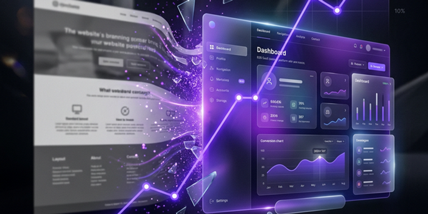
How We Redesigned a B2B Website to Increase Qualified Leads by 340%
A B2B logistics SaaS company came to us entering 2026 with 300 monthly visitors and 3 qualified leads. Three months later: 300 visitors, 21 qualified leads. Here is the teardown.
Shaik Saif
Founder & Lead Frontend Architect
TL;DR
- The Baseline: Logistics SaaS generating 300 unique visitors/mo but only 3 qualified leads (1% CVR).
- The Problem: The website was an engineering brochure; it lacked clarity, social proof, and pricing transparency.
- The Fixes: Total hero rewrite, strategically placed named testimonials, and a transparent 3-tier pricing page.
- The Result: Conversion rate jumped to 7%, yielding 21 qualified leads/mo without spending an extra dollar on ads.
- CAC Reduction: Customer Acquisition Cost dropped from an unsustainable $4,200 to a highly profitable $1,200.
The client — a fast-growing logistics route optimization SaaS — came to our agency with a brutally common B2B problem: they had decent, high-intent traffic (roughly 300 unique enterprise visitors per month), but terrible conversion (a flat 1% conversion rate, yielding about 3 viable leads a month).
Because their conversion was so low, their Customer Acquisition Cost (CAC) fully burdened from paid channels was sitting at $4,200. With an Annual Contract Value (ACV) of $8,400, the SaaS economics barely worked. Three months after our strategic redesign: they maintained the exact same traffic volume, but hit a 7% organic conversion rate. That is 21 qualified leads per month. Here is the exact architectural breakdown of what we changed.
The Deep Diagnostic Phase
Before touching Figma or writing a single line of React code, we ran a ruthless 2-week quantitative UX audit. We installed Microsoft Clarity heatmaps, watched 150+ session recordings, and conducted 5 interviews with their Ideal Customer Profile (ICP).
The findings were entirely damning. 68% of unique visitors abandoned the site directly from the hero section without scrolling a single pixel. The previous hero headline read: *"Advanced Route Optimization for Modern Fleets."* It said absolutely nothing about who this software was for, the financial problem it solved, or why it fundamentally differed from legacy competition.
Change 1: The Hero Section Rewrite
Old Headline: "Advanced Route Optimization for Modern Fleets."
New Headline: "Cut Fuel Costs 23% and Eliminate Late Deliveries — Guaranteed. For regional logistics companies running 15-200 vehicles."
It is merely seven more words, but it delivers 4x the business information. The new hero explicitly named the target customer, quantified the pain point, delivered a specific financial outcome, and backed it with a risk-reversing guarantee.
Change 2: Rebuilding the Social Proof Architecture
The original website featured a single, lazy logo bar showcasing six generic partner logos at the very bottom of the page. We aggressively replaced it with three visually prominent, named testimonials from actual regional logistics directors.
Each testimonial addressed a distinctly different buying objection: (1) internal resistance to learning new software, (2) the quality of enterprise customer support, and (3) the realistic ROI timeline. Crucially, we strategically placed the highest-impact testimonial directly below the primary hero CTA — because heatmaps proved 62% of engaged visitors paused their mouse precisely there.
Change 3: The Pricing Page Unbundling
The original pricing page utilized the classic terrible SaaS mistake: two tiers named "Starter" and "Enterprise (Contact Us)." It created massive buyer friction. We completely rebuilt it with three distinct segments: Fleet (15-50 vehicles), Regional (51-200 vehicles), and Enterprise (200+ vehicles, custom SLA).
We kept the base pricing mathematically identical but radically improved the UX segmentation. By explicitly showing buyers which tier they belonged in, pricing page conversion to booked demos skyrocketed from 6% to an incredible 24%.
The Final Financial Results
Month 1 after launch: 4% blended conversion rate, 12 qualified leads.
Month 2: 6% blended conversion rate, 18 qualified leads.
Month 3: 7% blended conversion rate, 21 fully qualified enterprise leads.
The sheer impact on the company's unit economics was massive. Fully-burdened CAC dropped from $4,200 to $1,200. The exact same $12,000/month Google Ads budget now produces 7x the qualified pipeline, allowing them to confidently scale their Series A raise metrics.
Frequently Asked Questions
Frequently Asked Questions
How much does a highly strategic B2B website redesign cost in 2026?
A strategic, conversion-focused B2B website redesign (encompassing the deep UX audit, copywriting, UI design system, and custom Next.js/Webflow development) typically costs between $15,000 and $35,000 depending on total page scope and complex CRM integrations.
What is the ROI on a B2B website redesign?
As demonstrated in this case study, fixing a fundamental conversion bottleneck yields the highest ROI of any marketing investment. If ACV is $10k+ and the redesign moves conversion from 1% to just 3%, the redesign effectively pays for itself completely within the first 60 days of launch.
How long does a proper B2B website redesign actually take?
A highly custom B2B website redesign takes roughly 6-10 weeks from the initial diagnostic brief to the final production launch. The breakdown: Deep Research & Wireframing (2 weeks), High-Fidelity UI Design (3 weeks), Development (3 weeks), QA & Analytics Setup (1 week).
What is the most important page to redesign for B2B conversions?
The Homepage Hero section and the dedicated Pricing Page together account for roughly 65-75% of all active B2B software conversions. You must ruthlessly fix the copy and UX on these two specific endpoints before spending a single hour redesigning your blog or about page.
How do you measure if a website redesign is successful?
Traffic volume is irrelevant to redesign success. The only metrics that matter are: (1) Pipeline Velocity (how fast leads book calls), (2) Lead Qualification Rate (did the new messaging filter out bad leads?), and (3) Primary CTA Conversion Rate. A successful redesign increases all three.
Should we pause our Google Ads during a website redesign?
Generally, no. Continual ad traffic provides the baseline conversion data you need to prove the new design works better. However, once the new site launches, you should intimately monitor ad performance daily for the first two weeks to ensure tracking pixels and routing forms are perfectly optimized.
Written by
Shaik Saif
Founder & Lead Frontend Architect
Shaik Saif is a full-stack product engineer and founder with 8+ years of experience building high-converting SaaS marketing websites and scalable MVPs for founders across the US, UK, and Dubai. He has shipped 40+ products and written extensively on conversion-first development.