
The 10 Best SaaS Websites in 2025

In 2025, the best SaaS websites focus on clear messaging, smooth user experience, and meaningful visuals to drive conversions. Sites like Databox and Wynter cut through clutter with straightforward copy and product demos that quickly show value. Interactive features and easy navigation, found on Apollo.io and Ramp, make exploring simple without frustrating visitors. Social proof is placed thoughtfully to build trust at key moments, as seen with PandaDoc and Loom. These sites avoid common pitfalls like slow updates or confusing layouts by sticking to basics done well. For marketers and founders looking to grow faster without tech headaches, studying these examples offers practical lessons in smarter website design today.
1. Databox: Clear Messaging and Trust-Building Visuals
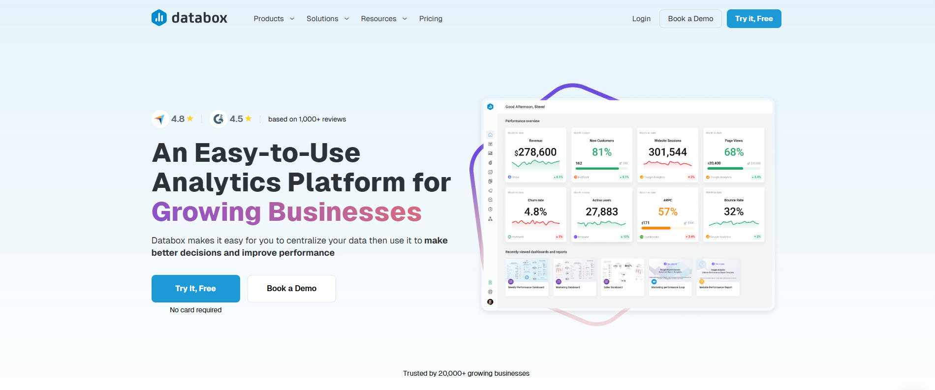
Databox excels by presenting a clear and straightforward message that immediately tells visitors what the product does and who it’s for. Its homepage uses simple headlines that cut through the noise, avoiding any confusion about the value proposition. The static hero images support this clarity by reinforcing the message without distracting users with unnecessary motion or clutter. Clear call-to-action buttons use direct language like "Get Started" or "See Plans" to guide visitors toward the next step effortlessly. One standout feature is the sticky pricing bar that stays visible as users scroll, making plan comparisons quick and easy without forcing users to hunt for information. Visual proof, such as charts and dashboards, adds credibility by showing real data in action, which builds trust right away. The homepage keeps minimal clutter, focusing attention on the key benefits rather than overwhelming visitors with too much content. A consistent color scheme strengthens brand recognition while keeping the overall design calm and approachable. Navigation is straightforward, allowing users to find relevant details quickly, which is essential for busy B2B buyers. The subtle inclusion of customer logos and testimonials supports credibility without feeling pushy. Finally, Databox ensures fast page loading speeds, which keeps users engaged and reduces bounce rates. Altogether, these design choices make Databox a textbook example of how clear messaging combined with trust-building visuals can drive conversions and build confidence in a SaaS product.
2. Wynter: Concise Copy with Balanced Multimedia

Wynter’s homepage stands out by delivering precise, jargon-free copy that gets straight to the point. Instead of overwhelming visitors with buzzwords, it uses clear language that quickly communicates the product’s value. Complementing the text is a looping product video that quietly demonstrates the software in action, helping users understand its use without distraction. The site’s design smartly employs bold yellow highlights to draw attention to key messages, but these pops of color never feel overdone thanks to ample white space around text and visuals. This whitespace improves readability and helps users focus on what matters most. Navigation is kept minimal and intuitive, making it easy for visitors to find relevant information without getting lost. Calls to action stand out through thoughtful color contrast and strategic placement, encouraging engagement without being pushy. By balancing text and visuals effectively, Wynter keeps visitors engaged longer and guides them naturally through the site’s content hierarchy. The site avoids heavy animations that might distract from the core message, instead relying on clean, purposeful multimedia elements that enhance understanding and reinforce Wynter’s clear, concise messaging.
3. Apollo.io: Interactive Design for Easy Exploration

Apollo.io stands out in 2025 with a website that balances polished interactivity and clear usability. Its clean typography ensures content reads well on any device, making it easy for busy B2B buyers to digest information quickly. Product animations are a key feature, showing real-time demonstrations of Apollo’s capabilities without overwhelming visitors. The site’s mega menu uses icons alongside text, which helps users jump straight to the section they need without confusion or extra clicks. Interactive tabs let visitors preview features right on the page, reducing friction and keeping engagement high. White space is used consistently to avoid clutter, helping users focus on what matters. Navigation is intuitive, with buttons and links that provide clear feedback on interaction, so users always know where they are and what’s clickable. Animations are smooth and purposeful, complementing the content rather than distracting from it. Content is grouped logically, guiding visitors naturally toward answers and next steps. Trust is reinforced by placing customer logos alongside product details, which adds credibility without interrupting the exploration flow. Overall, Apollo.io’s site design supports easy, efficient exploration through interactive elements and thoughtful UX considerations that respect the time constraints and needs of B2B buyers.
4. Ramp: Minimalist Layouts That Highlight Benefits

Ramp’s website nails the balance between simplicity and engagement through its minimalist design. The spacious layout gives text plenty of room to breathe, making it easier for visitors to focus on key benefits without feeling overwhelmed. Bold, clear typography directs attention to main points, while a restrained color palette reinforces a professional and trustworthy tone. Subtle animations catch the eye just enough to draw attention without becoming distracting, enhancing the overall experience. Navigation is straightforward and uncluttered, reducing cognitive load for busy users who want to understand value quickly. Calls to action stand out but don’t feel pushy, encouraging interaction naturally. Visuals serve a clear purpose by illustrating benefits simply and supporting the messaging rather than competing with it. Strategic use of whitespace separates content sections cleanly, allowing for quick scanning and effortless comprehension. Throughout the site, consistent design elements create a cohesive experience that feels polished and intentional, showing that less can truly be more when it comes to effective SaaS site design.
5. Loom: Problem-Solving with Social Proof

Loom’s website stands out by combining bold typography with smooth animated elements that keep visitors engaged without distraction. The use case sections are especially effective, clearly showing how Loom addresses specific communication challenges with video messaging. Each problem-solving example is supported by well-placed testimonials and case studies, creating a natural flow from identifying pain points to presenting Loom as the solution. Calls to action are strategically positioned near these social proof points, encouraging users to take the next step while trust is at its highest. The site’s layout guides visitors through a clear journey, supported by visuals that enhance the story without overshadowing the content. Navigation is intuitive, allowing users to jump directly to relevant use cases that matter most to them. Despite the rich animations and visual storytelling, the site maintains fast loading speeds, ensuring a smooth experience. Consistent brand colors and style throughout tie everything together, reinforcing Loom’s identity while focusing attention on how effectively it solves real problems.
6. PandaDoc: Frictionless Demo Booking and Trust Signals

PandaDoc’s website stands out by making the demo booking process simple and stress-free. Using subtle product animations, visitors quickly understand what the product does without sifting through walls of text. The demo signup flows step-by-step, guiding users clearly without overwhelming them. Key trust signals like client logos and testimonials are placed right where they matter most, near demo CTAs, adding confidence at the crucial moment. Navigation is straightforward, letting users jump quickly to demo scheduling or product details without confusion. Forms are minimal and fast to complete, helping reduce friction and prevent drop-offs. The site’s professional yet approachable design, combined with optimized page speed, creates a smooth experience that keeps users engaged and moving forward. This balance of clarity, trust, and ease of use makes PandaDoc a prime example of how to convert prospects effectively in 2025.
7. Craft: Strong Fundamentals Over Flashy Trends
Craft’s website shows that solid design basics often beat flashy trends. It uses clear, legible typography as the foundation, making every line of text easy to read and scan. The generous white space around content helps users focus without feeling overwhelmed. High-quality product images highlight key features without unnecessary effects, giving visitors a straightforward look at what the product offers. Navigation is simple, with a menu that uses clear labels so users always know where to go next. Calls to action are placed thoughtfully on every page, making it easy to take the next step. Rather than chasing trendy animations or gimmicks that might distract or confuse, Craft sticks to consistent spacing and alignment, which creates a polished, professional appearance. The color palette supports the brand identity but never overpowers the content, allowing users to stay focused on the message. The content hierarchy follows a logical flow, guiding visitors smoothly through the site. On top of that, the site loads quickly, which keeps visitor attention and prevents frustration. Craft is a good example that nailing the fundamentals, clarity, usability, and performance, builds trust and drives conversions more effectively than flashy design fads.
8. Labguru: Industry-Tailored Design with Engaging Content

Labguru’s website stands out by combining vibrant colors and custom illustrations that give it a unique, memorable brand presence. The design feels premium and carefully crafted to meet the expectations of life sciences and other specialized industries, where trust and professionalism are key. Frequent product videos showcase real-world applications, helping users quickly grasp how the platform supports their workflows. Navigation is smartly organized around specific user roles, making it easy for visitors to find relevant features without wasting time. Calls to action are precise and targeted, guiding different audience segments toward meaningful next steps. The site structure balances creative brand integration with usability, ensuring visuals add to the experience without becoming distractions. Despite rich media and detailed content tailored to industry language and norms, pages load efficiently, maintaining smooth user engagement. Together, the thoughtful visuals and clear, role-focused content build credibility and encourage deeper interaction, making Labguru a strong example of SaaS design tuned to a specialized market.
9. Second Nature: Audience-Aligned Visuals and Fun UX

Second Nature stands out by blending an immersive video hero section with relatable stock photography that immediately connects with visitors on an emotional level. The site’s positive, fun design elements create a welcoming atmosphere, making users feel comfortable and engaged from the start. Navigation is straightforward and user-friendly, guiding visitors naturally toward demo requests without any pressure. Calls to action are clear and inviting, fitting seamlessly with the content tone that matches the audience’s mindset and stage in their journey. Visuals are thoughtfully aligned with the brand’s personality and messaging, reinforcing trust and recognition throughout the experience. Despite heavy use of video and images, the site is optimized for fast loading, ensuring smooth performance. Interaction feedback is clear and supportive, encouraging visitors to explore and engage without confusion. This combination of emotional connection and smart UX design makes Second Nature a top example of how to attract and convert SaaS prospects effectively.
10. Asana: Simple, Uncluttered Design for Complex Products

Asana’s website stands out by making complexity feel manageable through a clean, straightforward design. It uses large, clear navigation menus paired with distinct typography and purposeful icons to help users quickly find what they need without confusion. Whitespace is used skillfully to reduce clutter and direct attention where it matters most, allowing visitors to absorb the product’s benefits without distractions. The messaging avoids jargon and keeps explanations simple, which is crucial for a product with many features. Visual cues are subtle but effective, balancing minimalism with enough guidance to encourage exploration. Typography choices emphasize readability and establish a clear hierarchy of information, while icons support the core message instead of serving as mere decoration. Overall, the site reflects Asana’s core values of productivity and ease of use, proving that even complex SaaS products can benefit from a simple, user-focused design.
Common Issues Slowing SaaS Website Growth Today
Many SaaS websites struggle with slow development cycles, which delay marketing campaigns and make teams miss key growth windows. When it takes weeks or months just to launch a landing page or update messaging, the opportunity cost can be high. Messaging itself often lacks clarity, leaving visitors confused about what the product does or how it benefits them, which naturally lowers conversion rates. Poor user experience adds to the problem by frustrating visitors, complex navigation, cluttered layouts, or unclear CTAs increase bounce rates and reduce engagement. On top of that, multiple stakeholders and unclear approval processes create bottlenecks that slow down site updates and improvements. Hiring full-time designers and developers to maintain the site introduces overhead and management challenges, especially for startups with limited resources. Technical hurdles like integrating tracking pixels, CMS features, or forms often require specialized skills, further delaying campaigns. Weak or inconsistent calls to action fail to push visitors to take the next step, and branding that isn’t cohesive weakens trust and makes it harder to stand out in a crowded market. Without agile workflows, teams can’t quickly iterate based on user feedback or campaign performance, causing them to fall behind competitors who move faster. All of these issues combined create a frustrating cycle that stalls growth and wastes valuable marketing efforts.
- Development cycles are often too slow, causing marketing delays and lost opportunities
- Messaging frequently lacks clarity, confusing visitors and reducing conversions
- Poor UX design leads to frustration, increasing bounce rates and lowering engagement
- Multiple stakeholders and unclear approval processes create bottlenecks in launching updates
- Hiring full-time designers and developers adds overhead and complexity
- Tech integration challenges, like adding tracking or CMS features, slow down marketing efforts
- Underperforming CTAs reduce pipeline growth and fail to drive action
- Inconsistent branding weakens trust and reduces differentiation from competitors
- Limited resources cause teams to miss launch windows and fall behind in market timing
- Lack of agile processes prevents quick iteration based on user feedback or campaign needs
How Top SaaS Sites Avoid Messaging and UX Mistakes
Top SaaS websites in 2025 avoid common messaging and UX mistakes by focusing on clarity and user needs from the start. They use straightforward, concise messaging that quickly explains what the product does and why it matters. Instead of generic stock photos, they show real product use cases through visuals and subtle animations, helping visitors understand value immediately. Navigation is simple and intuitive, designed to respect the busy schedules of B2B buyers who want answers fast without getting lost. Social proof like customer logos and testimonials is placed where it matters most, boosting trust without overwhelming the page. These sites maintain consistent branding that stands out but never distracts from their core message. Interactive features such as tabs and mega menus make it easy to explore different product aspects without confusion. Thoughtful use of whitespace and clean typography guides attention and lowers cognitive load, making the site feel approachable. Calls to action are clear, direct, and aligned with what users want to do next, ensuring no guesswork. Multimedia elements like videos or animations enhance the story without slowing down the site or distracting users. Finally, top SaaS sites never stop testing and refining their UX to remove friction points, improve conversions, and keep the experience smooth as user expectations evolve.
How Shaiksaif Speeds Up SaaS Website Launches and Updates

Shaiksaif helps SaaS companies launch and update websites quickly without the usual wait for internal teams or freelancers. By delivering landing pages rapidly, they eliminate bottlenecks that slow marketing campaigns. Their approach includes redesigning existing sites to boost user experience and conversions, applying proven SaaS design principles rather than trendy distractions. Using Webflow, managed by certified experts with over seven years of experience, Shaiksaif adds tracking, forms, and CMS features smoothly, ensuring sites are secure and scalable. This means SaaS businesses avoid the cost and hassle of hiring full-time developers or designers, cutting overhead while keeping updates fast and flexible. Shaiksaif’s process is tailored specifically for the needs of SaaS and B2B startups, focusing on practical solutions that align design and development closely with marketing goals. This ensures every update directly supports growth metrics and avoids unnecessary complexity, making it ideal for agile marketing teams that require quick turnarounds without sacrificing quality or control.
Shaiksaif’s Approach to Cutting Costs and Removing Bottlenecks
Shaiksaif offers a straightforward flat monthly rate for unlimited design and development work, making budgeting simple and predictable for SaaS companies. This approach removes the fixed costs and overhead tied to hiring full-time staff, freeing up resources for growth initiatives. By acting as a single point of contact for all design and development needs, Shaiksaif streamlines workflows and eliminates delays caused by switching between freelancers or juggling internal teams. Their expertise in Webflow allows them to implement new features quickly without the long coding cycles traditional development demands. This speed reduces time-to-market, enabling marketing teams to launch campaigns faster with ready website support. Shaiksaif focuses on scalable solutions that adapt as SaaS companies grow, removing technical headaches around integrations and ongoing maintenance. Continuous improvements can be made without needing additional hires or retraining, keeping costs down and agility high. For example, a SaaS startup can rapidly test landing pages or add tracking tools without waiting weeks or facing unexpected expenses, thanks to Shaiksaif’s all-in-one service model.
Why Shaiksaif Beats Hiring In-House or Freelancers
Shaiksaif offers a clear advantage over hiring in-house teams or freelancers by delivering faster turnaround times that keep your SaaS website agile and ready for market changes. Instead of juggling variable freelance rates or the overhead of salaries, Shaiksaif provides predictable costs with a flat monthly fee and unlimited design and development, maximizing value without hidden surprises. Their team consists of certified Webflow developers with specialized SaaS and B2B startup expertise, ensuring quality and consistency that generalist contractors often lack. This means fewer delays, less management complexity, and no worries about freelancer availability or employee turnover disrupting your projects. By partnering with Shaiksaif, your internal team can focus on growth strategies while technical website work is handled reliably and efficiently. The service is built for agile marketing, responding quickly to shifting priorities and scaling alongside funded startups who demand reliability and scalability in their web presence.
Book a Free Strategy Call to Scale Your SaaS Website Faster
A free strategy call with experts is a smart way to tackle your SaaS website challenges head-on. This session lets you discuss your specific growth goals and site issues, receiving tailored advice on improving your messaging, user experience, and conversion rates. You’ll learn practical ways to remove bottlenecks and speed up launch timelines, helping your marketing efforts gain momentum faster. Shaiksaif’s flat-rate service model means you can plan your budget without surprises, while still getting access to certified Webflow developers who know how to build scalable, high-performing SaaS sites. During the call, you can explore how to integrate tracking tools, forms, and CMS features smoothly, avoiding common technical headaches. It’s also a chance to understand ongoing support options that keep your website evolving alongside your business. By evaluating Shaiksaif’s approach against your team’s workflow and priorities, you can decide if this solution helps reduce hiring overhead and technical roadblocks. Taking this step unlocks faster growth through a website that truly supports your SaaS business goals.
Frequently Asked Questions
1. What makes a SaaS website stand out in 2025 compared to previous years?
In 2025, SaaS websites stand out by focusing on seamless user experience, advanced interactivity, and personalized content driven by AI. They also prioritize fast load times, mobile responsiveness, and clear, value-driven messaging to engage visitors effectively.
2. How do top SaaS websites ensure they cater to diverse user needs and industries?
Leading SaaS websites use customizable features, intuitive navigation, and segmented content that addresses specific industry challenges. They also offer flexible integration options and detailed demos or tutorials to help different users find value quickly and easily.
3. What role does design play in the success of the best SaaS websites in 2025?
Design is crucial because it influences first impressions and usability. The best SaaS sites combine clean layouts with engaging visuals, consistent branding, and accessible interfaces. This approach helps build trust, simplifies complex information, and encourages conversions without overwhelming visitors.
4. How do the best SaaS websites handle content to keep users engaged and informed?
Top SaaS websites use a mix of educational blog posts, videos, case studies, and interactive tools that provide real value. They update content regularly to reflect industry trends and customer feedback, which keeps users coming back and positions the company as an expert in its field.
5. In what ways do the leading SaaS websites incorporate technology to improve user interaction?
Leading SaaS websites use AI-powered chatbots, personalized recommendation engines, and seamless integrations with other tools. These technologies streamline communication, offer tailored experiences, and reduce friction, helping users solve problems faster and make informed decisions.
TL;DR The best SaaS websites in 2025 stand out by combining clear messaging, product visuals, smooth navigation, and smart use of social proof to boost conversions. Common challenges like slow development, confusing UX, and tech hurdles still slow growth for many SaaS companies. Shaiksaif offers a faster, cost-effective Webflow-based solution that helps teams launch and update sites quickly without the overhead of hiring in-house or freelancers, making it easier to scale marketing efforts and avoid bottlenecks.
.webp)
.jpg)
.jpg)

Let's Take Care of your Webflow Site.
We're a tight-knit team of webflow experts that eat, sleep, breathe Webflow. You bring your ideas or designs and we will make it happen, no matter the complexity.

.svg)
.png)
.png)